Deleted
Deleted Member
Posts: 0
|
Post by Deleted on Apr 25, 2015 14:34:15 GMT
Hello Judith. They came out very lovely...
Elizabeth I wish you happy and safe travels to Peru.. Look forward to the photos.
|
|
|
|
Post by luvswool and dyestuff on Apr 27, 2015 23:43:19 GMT
This is one of the landscapes I worked on while at a retreat in the Ozarks, Arkansas recently. It’s basically an impression of some lichen-covered rocks I saw, which included broken branches, dead leaves and some new spring growth as well. My problem is that I don’t feel it’s cohesive and I need something else…perhaps to tie it all together. So lovely ladies, what would you suggest? What’s missing? 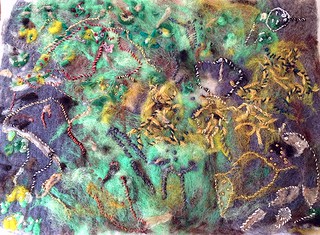 Ozarks 100 Ozarks 100 by catwycliff, on Flickr |
|
|
|
Post by MTRuth on Apr 28, 2015 1:32:25 GMT
When I squint at it, the values all seem pretty close. So perhaps adding more darker values?
|
|
|
|
Post by koffipot on Apr 28, 2015 6:18:49 GMT
I like it as it is.
|
|
|
|
Post by aphee on Apr 28, 2015 17:27:20 GMT
Is it for a wall hanging (I mean the aspect won't be changed by a volume ?)
I would have put more brown / grey for the rocks/branches to give more contrast as Ruth says
|
|
|
|
Post by Pandagirl on Apr 28, 2015 20:49:44 GMT
The textures and colors are wonderful Cathy. It really looks better in person. :-) But I agree it needs some more definition. Ruth and Aphee make good points of using darker values.
|
|
|
|
Post by MTRuth on Apr 28, 2015 21:08:41 GMT
Have you looked at it from a distance? Sometimes that helps to see what it needs. Perhaps more emphasis on a focal point?
|
|
|
|
Post by luvswool and dyestuff on Apr 28, 2015 21:48:44 GMT
All good recommendations, thanks. It helps me to post the photo and look from a distance. I see now, as Ruth alludes to, that there is NOT a focal point, and that additional darker colors could be added. Darker values. Yes.
It will be a wallhanging, Aphee. I could add darker texture, more branches.
|
|
|
|
Post by Shepherdess on Apr 29, 2015 1:50:59 GMT
I agree. There is no focal point. I think that will help it come together I think.
|
|
|
|
Post by carole aka craftywoman on Apr 29, 2015 13:57:25 GMT
I like it the way it is too, it is lichen/moss and it shows that, were there darker colours in real life? because that would be my only suggestion, but only if they were there as nature usually has it right.
|
|
|
|
Post by MTRuth on Apr 29, 2015 16:41:02 GMT
Usually if you look back at the source, nature almost always has contrasting dark and light values unless you crop very closely.
|
|
|
|
Post by luvswool and dyestuff on Apr 29, 2015 22:31:59 GMT
So here is the photo which provided my inspiration, and I say that very loosely. I never try to copy what I see in nature. I don’t see a particular focal point, and perhaps that is the fault of the photographer. What do you think? 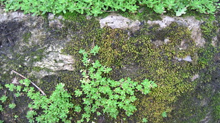 ozarks 2 ozarks 2 by catwycliff, on Flickr |
|
|
|
Post by MTRuth on Apr 29, 2015 22:39:46 GMT
I would try cropping the photo in different ways to see if you come up with what you feel is a focal point. Or you can just make your own in your piece. I think the focal point is the "heart" shape on the right. And there is definitely a lot of contrast of value in this photo.
|
|
|
|
Post by luvswool and dyestuff on Apr 30, 2015 13:48:40 GMT
Thanks for all the comments and suggestions. Adding embroidery and taking another look!
|
|
|
|
Post by koffipot on Apr 30, 2015 18:53:41 GMT
If in doubt, I find changing a photo to grayscale a good way to determine value.
|
|