|
|
Post by zed on Feb 6, 2016 10:38:57 GMT
That fabric looks great, Marion  |
|
|
|
Post by sundownalpacas on Feb 6, 2016 12:00:25 GMT
I've had another play with resists - although I'm sticking with the flat kind for now though! I bought some fabulous metallic fabric whilst in York at the weekend and wanted to try it out. I like the contrasting texture with the wool felt. I love this, especially the second piece, if you turn it vertically, it looks like an alien's face. The metallic fabric looks great as the eyes and nose. |
|
|
|
Post by Pandagirl on Feb 6, 2016 16:51:02 GMT
Great textures Marion. Love the bling!
|
|
|
|
Post by Shepherdess on Feb 7, 2016 1:25:54 GMT
Great Texture with the metallic fabric.
Frances, I think I forgot to say how lovely your scarf is.
|
|
|
|
Post by lyn on Feb 13, 2016 17:59:53 GMT
I wanted to use a flat resist in a way that I hadn't done before, so I had a go at 'cracked mud'. Like any technique, practice definitely improves things, so here's my first (left) and my second (right) go at it. 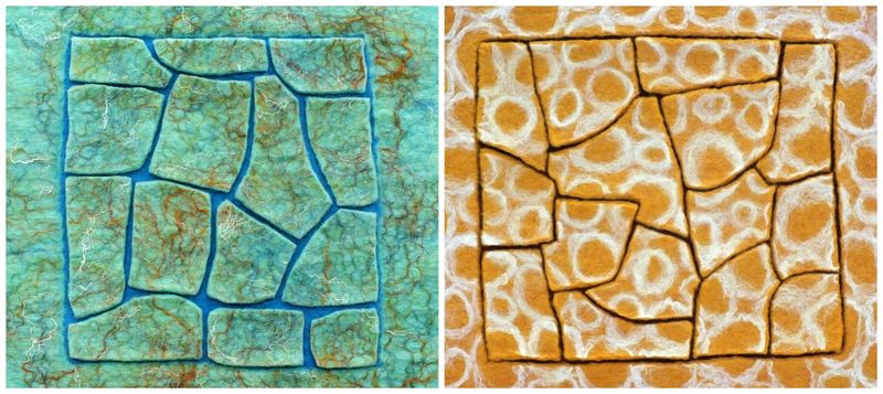 (I wrote a blog post detailing my efforts.) |
|
|
|
Post by MTRuth on Feb 13, 2016 18:46:07 GMT
Cool Lyn. I like them both. I'm off to take a look at your blog post |
|
|
|
Post by Teri Berry on Feb 13, 2016 19:02:10 GMT
They're both great Lyn. Call me perverse but I think I prefer the blue one where a bit more of the top layer has been cut away  But the giraffe print is pretty cool too |
|
|
|
Post by lyn on Feb 13, 2016 20:00:55 GMT
I prefer the blue one too Teri. So perhaps a satisfactory end result is more important than getting the technique text-book-correct?
Also, you can't see the lovely red under the cracks in giraffey.
I had already begun to re-think things after Zed's blog post with her pretty 'starfish', but obviously forgot all about my new thoughts when I saw that I hadn't quite achieved what I'd set out to do. I must think I'm still at school and trying very hard to please the teacher.
So, going on from that, if my blue cracked mud were to be simply decorative rather than hard-wearing and functional, then it's ok isn't it?
Also, the first effort (because the blue is only 3 fine layers) looks amazing when held up against a window - the light emphasises the vibrancy of the blue and shows more depth/3D to the piece.
p.s. thanks for the chopstick trick
|
|
|
|
Post by Teri Berry on Feb 13, 2016 20:23:25 GMT
Not wanting to pile challenge upon challenge (well, maybe just a little!) it sounds like your next cracked mud project should be a lamp shade |
|
|
|
Post by lyn on Feb 13, 2016 21:21:48 GMT
I think I'm lampshaded-out Teri (did loads a few years back and not done one since).
But I can see your point - and I think the cracked mud would have to be two layers, not three, either side of the resist.
|
|
|
|
Post by MTRuth on Feb 13, 2016 21:58:39 GMT
Just went over to the blog to see what the "chopstick trick" was. Good idea Teri.
|
|
|
|
Post by elizabeth on Feb 13, 2016 22:22:48 GMT
I vote for the blue one, too, but it may just be the colors. I like the chopstick idea - it is hard finding the channels after felting.
I see that Murphey's law applies to felting - if you want it to felt it won't; if you don't want it to felt it will!!
|
|
|
|
Post by Pandagirl on Feb 13, 2016 22:33:57 GMT
Lyn, both look good, but the blue one is in my color house. :-)
|
|
|
|
Post by Shepherdess on Feb 14, 2016 2:47:16 GMT
I like the blue best but I like the bigger channels. I wonder if leaving the resist in after its cut would work. maybe put your piece in a frame that has glass on both sides or no back and hang it in the window
|
|
|
|
Post by koffipot on Feb 14, 2016 6:50:58 GMT
I prefer the blue one too, I like the definition of the wider channels.
I must look out for the chopstick trick.
|
|


 But the giraffe print is pretty cool too