|
|
Post by Pandagirl on Mar 12, 2015 14:38:34 GMT
I've had one for years. I know you can get them at any art store or dharmatrading.com. They are handy to have around. That was a nice gift to receive Frances.
|
|
|
|
Post by Pandagirl on Mar 23, 2015 16:59:04 GMT
|
|
|
|
Post by elizabeth on Mar 23, 2015 17:24:10 GMT
Color is an interesting thing. For an art class in college, we had to get spectrum-correct paper in the primaries and secondaries. The task was to put shapes on a black background such that the impact of all 6 colors was the same. We were all surprised at how 'purple' the true red was. It was very much a magenta color. Some people ad-libbed and picked the more orange red that they thought was correct. The task was more difficult that I expected - it's virtually impossible to have yellow and purple on a black background give the same visual impact. I think I ended up with a pinprick of yellow and a saucer of purple. And then there was the doofus who did not tell the prof that he was colorblind. He also ad-libbed and selected his own colors, and didn't even come close. I was searching for the type of paper we used (and trying to dredge up a 35-year-old memory) and didn't find what I was looking for. On the other hand, I did find an interesting article by someone ranting about using incorrect primaries. On the computer, it's hard to make out the differences. midimagic.sgc-hosting.com/pricol.htm |
|
|
|
Post by MTRuth on Mar 23, 2015 17:26:40 GMT
That sounds like a fun exercise. My teacher said that yellow is the "bully of the color wheel" and you always want to use less of it so it isn't so overpowering.
|
|
|
|
Post by lyn on Mar 23, 2015 18:12:49 GMT
Ooooh Elizabeth - the info in that link is very interesting, but I think I'll have to read it a few more times before I get a grip on it.
|
|
|
|
Post by koffipot on Mar 23, 2015 21:11:04 GMT
Interesting link thanks Elizabeth, I'll read it more fully later. My colour work today was mixing a suitable undercoat for some muted sagey green gloss paint. I only had white and a dark blueish green, which together made a mint green. A tad of red pigment to knock it back, then a bit of black to get the shade - voila "DRAB" just the ticket!  I just hope I've mixed enough.  |
|
|
|
Post by Pandagirl on Mar 24, 2015 0:44:39 GMT
Confusing to say the least.
Elizabeth. I did recognize the "correct colors" as those used in printing like in printing presses.
|
|
|
|
Post by zed on Mar 24, 2015 9:36:39 GMT
I think I came across that same link, Elizabeth when we first started doing this challenge. I thought I'd make myself a colour wheel on Photoshop but ended up with a combination of 'old' colours and 'new' or 'printing/screen' colours as I was thinking of them.
I think most of us tend to use a few different backgrounds for taking photos because things look different depending what you use.
I did some colour blending yesterday, using 'hot pink', I added different amounts of white and black.
|
|
|
|
Post by halay on Mar 24, 2015 11:15:05 GMT
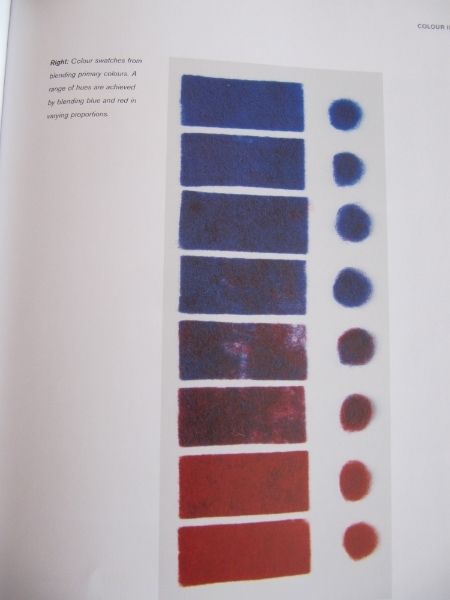
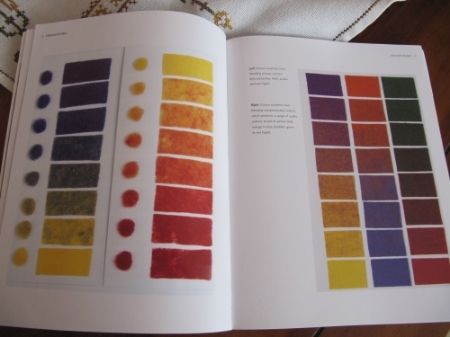
I think I'm going to skip this first quarter challenge simply because I don't have a carder to make blends. It was interesting though to learn from you and see your experiments. I've just received a book by Sheila Smith (Felt to Stitch) where I found a chapter on blending colours. I photocopied two pages:. Here is the result of blending two primary colours (blue and red)  then blue and yellow and yellow and red and another page on blending complementary colours.  |
|
|
|
Post by lyn on Mar 24, 2015 12:12:59 GMT
Nada - you can blend colours just using your hands or dog grooming brushes.
I like the book pages.
|
|
|
|
Post by Pandagirl on Mar 24, 2015 15:58:23 GMT
Nada, I just bought that book and the blends are a good representation of fiber blends.
|
|
|
|
Post by MTRuth on Mar 24, 2015 17:10:50 GMT
Yes, I ended up blending mine mostly by hand. It seemed to work better than using the hand carders.
|
|
|
|
Post by halay on Mar 24, 2015 17:37:54 GMT
Thanks Lyn and Ruth. I've got two dog grooming brushes and will see how it works.
Marilyn, what do you think of the book? I think it's a good one but more suitable for beginners.
|
|
|
|
Post by Pandagirl on Mar 24, 2015 20:53:56 GMT
Thanks Lyn and Ruth. I've got two dog grooming brushes and will see how it works. Marilyn, what do you think of the book? I think it's a good one but more suitable for beginners. I agree Nada, but it's always interesting to see what others are doing. I think I learn little something with every book or get ideas for colors, projects, techniques. Its funny the Nuno sample she has on page 68 I did several months ago before I had the book. I made it for my daughter in law who wants a wall hanging in her living room. We still have some decisions to make on color and texture before I proceed. Seeing the pic especially the colors gave me a chuckle because mine was very similar. |
|
|
|
Post by Shepherdess on Mar 24, 2015 21:17:57 GMT
yes, yellow is very loud and you only need a little bit to make an impact. My colour class was with a weaver and my dye class with a fiber dyer. We were taught that there are 6 primaries 3 painters( natural colours) and 3 printers( the bright colours for printing).
|
|

